WORK 01
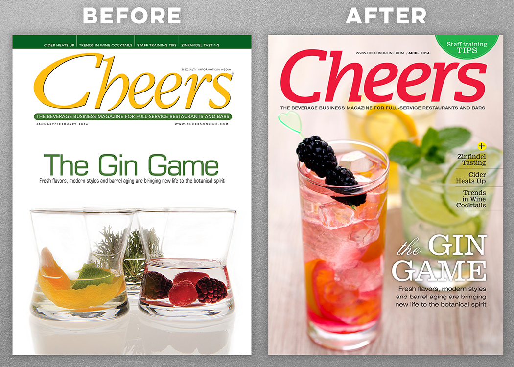
Cheers Magazine
The original Cheers design was completely out-dated, boring and the brand logo looked a bit like “C – beers”, instead of Cheers.
I updated the entire design of the publication, from logo, colors, fonts and photography. My overall theme was “Clean, Professional and a little Rock and Roll.”
WORK 02
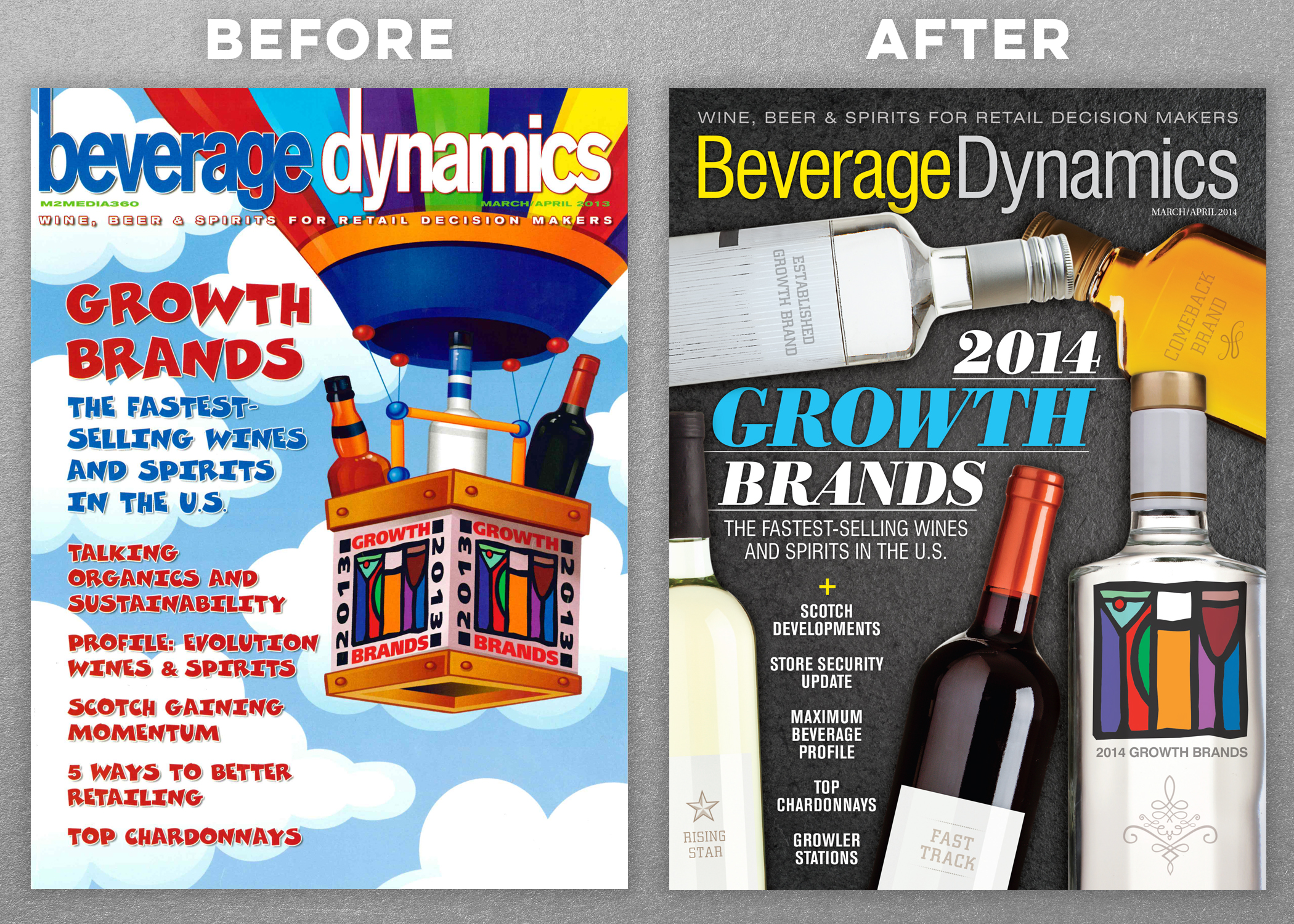
Beverage Dynamics Magazine
Beverage Dynamics had similar issues but needed even more help. The original design was cartoonish and looked like it was aimed at children.
Being an adult beverage magazine, I matured the entire look with a new logo, fonts, colors and photography.
WORK 03
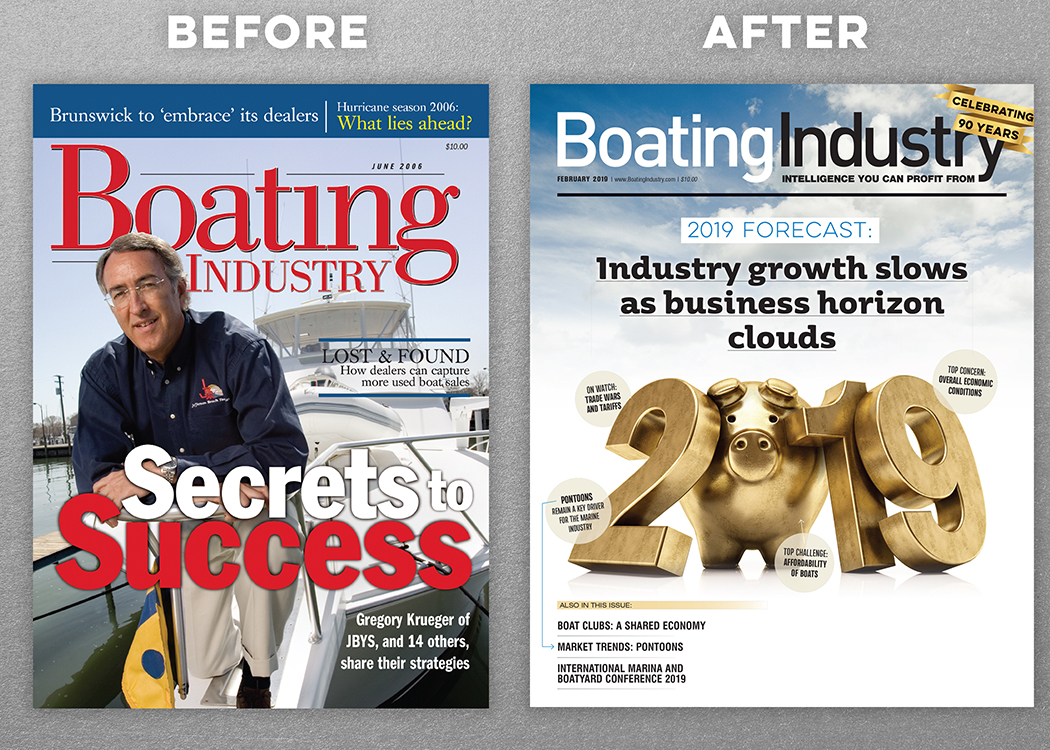
Boating Industry Magazine
Boating Industry already had an established, professional-looking design, it just needed a modern update.
I redesigned the entire magazine including the trim size. We went with a wider trim for a more dynamic look. I also redesigned the cover to have several options, some images could go full-bleed, while some would be better suited “boxed in”, in cases where our photography didn’t allow full-bleed. (Very limited budgets).